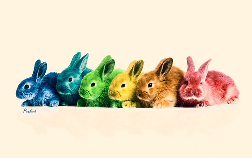
Todays blog is all about colour and how colour changed everything ! and before you go "o_oh she paints her bunnies!!oh nooooo!" I don't I do not breed rainbow bunnies or green bunnies or even bunnies that glow in the dark..lol..I do dye the fibres and yarns. How? I use natural pigments, acid dyes of all kinds and even food dyes. How do I determine what colours to put together? well, its basically look at nature, inspiring photos, look out the window really..lol...there is no rhyme or reason , I just combine my feelings and translate it in my dye formulas. Here is more of an explanation on how colours have changed the world and how we see things. This is a bit technical now and again but it does give you heaps of back ground info so you can 'de construct' colours and see it in a different light !
In 1858, Queen Victoria wore a lilac-coloured gown to her daughter’s wedding. That dress changed our world.
In 1858, Queen Victoria wore a lilac-coloured gown to her daughter’s wedding. That dress changed our world.
A couple of years earlier, in England, a young chemist named William Henry Perkin was trying to develop an anti-malarial drug by using a liquid extract from coal tar. He accidentally spilled some of the liquid on a white cloth and noticed that the splattered part of the cloth had turned a light purple, or lilac colour.
The next morning, he dipped a silk sheet into the liquid and the same purple colour was re-created. Perkin had just discovered the world’s first synthetic dye.
Purple was the colour of kings, reserved for the royal robes and previously could be made only from the glandular mucus of mollusks. When Queen Victoria wore a gown
coloured by this new synthetic dye, it caused a fashion sensation.
On both sides of the Atlantic, women clamoured to have a dress, a scarf, any fashion accessory coloured in the “Queen’s Lilac.” This great demand drove market innovation for more synthetic dyes and more colours.
Industrial dye industries responded, and colours for clothes previously reserved for royalty became available to the masses.
The early-Victorian era of dressing in relatively subdued colours gave way to clothes dyed in every colour of the rainbow. Cultural critics cringed; they sniffed and complained about “too much colour,” but it was too late. The fashion genie in all its glorious colour had been released from the lamp and it was never going to be put back in.
Colour attracts us; it’s biological; we can’t resist a gorgeous sunset, neon lights, a bright-red cardinal, blue eyes and blue skies. In the business world of consumer goods, choosing the right colour can make you rich, or choosing the wrong colour can send you to the poorhouse. The fashion industry has known this for a long time.
After the turn of the 20th century, as mass consumption ramped up, creators of other consumer goods soon learned that the pot of gold wasn’t to be found at the end of the rainbow—it was inside the rainbow.
In the early 1920s, the Ford Motor Company dominated the American automobile industry. Henry Ford famously said: “You can have any colour car you want, as long as it’s black.” The French called American cars “funeral cars,” according to author Regina Lee Blaszczyk, in her book The Colour Revolution.
In 1923, an upstart car company, General Motors, introduced the Oakland, their own economy car to compete with Ford’s Model T. The Oakland and the Model T were very similar in design and durability, except for one detail. You could buy an Oakland
painted blue. They sold like blueberry hotcakes.
The next year, GM offered more car colours. These cars were painted with a new nitrocellulose lacquer called Duco, created by the DuPont Company.
Duco was a quick-drying paint that reduced the time needed to complete a car-body paint job, from 10 days to eight hours, and this paint could be sprayed on. Earlier automobiles had been painted with a brush. Coloured cars became America’s
new status symbol. Many new car models were painted in more than one colour. Even Henry Ford was forced to adapt and change, offering Fords in different colours.
At the 1926 National Automobile Show, only seven percent of the new models were painted black, according to The Colour Revolution. Almost overnight, our visual landscape
changed. Colour sells. Remember the first coloured rotary phones, avocado-green
refrigerators and “shocking pink” nail polish? With many products, colour became as important a selling tool as form and design.
During a lecture, author Blaszczyk described how this new consumer culture created new occupations: colourists, colour engineers, colour stylists and colour forecasters. After World War I, the United States began to dominate world consumer culture. Colour in industry reflected two major trends: first, the rise of the American consumer, and second, the rise of women as consumers. It was believed that women were better at perceiving diff erences in colour. (Recent scientific studies support this.)
Women consumers had always been predominant in the fashion industry, but in post-World War I America they were becoming increasingly important in the selection of cars, household appliances, interior paints, kitchen wares and home decorating. Good Housekeeping magazine asked: “Shouldn’t your home be colour coordinated?”
“Remember the era of brown and orange in the 1970s? Mauve and teal in the 1980s? Hunter green and garnet red
in the 1990s? Every age has its colour preferences! I can almost tell the age of someone’s furnishings when I walk into their home,” says Jan Jessup, thank,
or blame, Birren. Eighty-nine-year-old Charles DeMirjian is a retired director of packaging and design with the DuPont Company. He began his career in 1954 and worked with, or as he says, “interfaced” with, the colour pioneer Birren, and remembers him as “a brilliant man, who comprehended colour in its scientific characteristics.” DeMirjian also had his own distinguished career working with colour.
Trained at the Philadelphia Museum of Industrial Arts, he worked on product package design. In a mass retail store, your product on the shelf must stand out and distinguish itself from others, according to DeMirjian.
“Shelf facing and an understanding of colour becomes critical. Warm colours advance, cool colours retreat,” he says. DeMirjian was also there at the beginning of the do-it-yourself interior home painting craze that continues to this day.
DuPont invented Flow Kote, a water-based latex paint that enabled consumers to select the colour of paint they wanted from a custom colour card, rector of merchandising for Calico, fabric
and home-decorating stores with 85 locations nationwide. “I often visit with textile designers that create upscale fabrics for Calico’s top vendors,” explains Jessup. “We all have [our] fingers to the wind to see how colour in home fashion is evolving.
Spa blue is still going strong by the way, but it is morphing into brighter turquoise and stronger teal hues. Apparel fashion tends to be revolutionary, while home fashion is more evolutionary.” Faber Birren was a colour pioneer. Largely self-educated (like all great colourists), he combined art and science. He believed in “functional” colour—that
colour in our surrounding environment could set a mood—and he consulted with companies, showing them how to put the power of colour to work to improve profi t. Birren began working in the 1930s and colourized school desks, typewriters, highchairs and vacuum cleaners. He advised one Chicago meat wholesaler to paint the walls bluegreen surrounding the meat display; it made the meat look redder and fresher.
Sales improved dramatically. Remember those avocado-green refrigerators? In elementary school, did you have a light pink—a colour thought to sooth and calm—metal desk and chair? For those colour choices, you can have it mixed in the store, and walk out the door with colour in hand.
“Colour availability became virtually endless,” says DeMirjian. Some years ago, the Eastman-Kodak Company used several diff erent companies to print packages for its Kodachrome film. Kodak ended
up with several different shades of its yellow-orange boxes, and consumers
declined to buy the fi lm packaged in the darker shades, thinking those boxes contained older fi lm. In manufacturing and colour reproduction, colours, shades and tints must be standardized and made uniform.
How is this accomplished?
Pantone LLC developed the Pantone Colour Matching System that sets the colour technology standards most used today. Pantone, Inc. was a commercial printing firm from New Jersey that began in colour technology in the early 1960s, when an employee named Lawrence Herbert used his knowledge of chemistry to set uniform standards for colour printing. In 1974, Pantone entered the digital world when the comSystem for computerized colour matching. Today, according to the company’s website, Pantone colour systems and technologies set the industry colour
standards for paints, plastics, industrial design, consumer products, printing,
graphic arts and fashion. Using the Pantone Colour Matching System, a fashion designer in New York orders clothing from a supplier in Lima, Peru, coloured in Tangerine Tango.
When the clothing order arrives there are no unfortunate surprises—the colour the designer ordered and what she receives, match exactly.
This is exactly why, when I get asked to do a custom dye, I ask for the pantone nr of the colour they have in mind. Blue or green or purple as a description just does not tell me the exact tone or hue: there are thousands of blues if not more !
Saying that, even when people give me a pantone nr to match, it is impossible to duplicate it exactly. It depends on the fibre (silks will reflect the dyes much better than a “dull/less reflective fibre” such as merino or angora. As with everything, the shinier the surface, the more it will bounce the colours off.
Have you ever found yourself wondering how the exact same graphic file, for example a corporate logo, can look different depending on where you see it? If you’re a communications manager and have ever been tasked with making sure your logo looks consistent wherever it is used, then chances are you have run into all kinds of different issues related to colour reproduction.
The reasons behind this are complex - the average person can easily distinguish at least a million variations in colour, and with a bit of careful observation, most people can learn to see very subtle differences in hue, tint, contrast and saturation which greatly extends the number of variations in colours that we perceive.(For a really great explanation on how we actually see colour - look no further than Pantone themselves in this article on their website:
http://www.pantone.com/
Turns out, humans evolved with a lot of reliance on our ability to distinguish colours, and we’ve got really good memories for colour too.
There is a lot of information in “colour” - and to make it a useful part of communication, designers and printers needed to come up with an “alphabet” of sorts to reproduce them. At the simplest level, we can think of Pantone Colours, as just one of the many colour alphabets we can use when describing colour. There are several; but there are effectively just a few in common use in commercial design, printing and reproduction, and I’ll review them as they relate specifically to the Pantone colour system.
If you’re not familiar with the Pantone brand, check out their website - http://www.pantone.com/.
We see colour imagery everywhere, and we take it for granted. Most of the time, we don’t have the “original” intended image to compare the reproduction to, so we don’t notice the differences even if we are familiar with the original image. But for example, if you put a magazine ad featuring the Mona Lisa, next to the real thing, you’d see the difference in colours fairly easily if you looked closely.
The same is true for the vast majority of printed and digital design materials today; the colours you see are only an approximation of the original intent of the graphic designer, photographer or illustrator who developed the imagery for the image. Exactly how accurate that approximation is, depends mostly on the reproduction technology used, and the inherent limits of that technology.
Pantone colours are designed as set of pre-determined colours that can be used in graphic design to establish a common reference point for the original intended colour. There are many different ways to do this - Pantone just happens to be the one that is most popular with designers and print professionals.
When it comes to corporate graphics like logos and wordmarks, there are generally just a few colours used in the design - sometimes even just one colour. And in corporate communications, we’re all familiar with the idea that a business has “a specific shade of blue” that is part of the brand.
If you’re familiar with the logo and that shade of blue, it becomes quite obvious when the colour is “off”. And, if you’re a communications professional, you might have experienced a situation where a Pantone colour is used, but it doesn’t look the same everywhere. And you might have thought to yourself “well, what the heck was so important about picking a Pantone colour then? The blue doesn’t look the same!”
So before you go stomping off to argue with a supplier, it’s important to have at least a generalized understanding of how the colours are reproduced.
When it comes to reproducing that specific shade of Blue, there are a two primary colour reproduction technologies that are commonly used, and each one will describe that shade of blue differently. Both of these technologies represent an alphabet (of sorts) useful for describing some colours. This is where Pantone colours or “spot” colours come into play - sometimes we want to describe some colours that the standard alphabets “don’t have letters for”
The primary reproduction technologies I am referring to, can be summarized as
•print technologies
•on-screen technologies.
Pantone colours are primarily concerned with the world of printed graphics, and they play a role in on-screen colour reproduction as well, but we’ll start with how they work in print first.
Print Technologies
The vast majority of printed colour materials, are reproduced using various applications of the CMYK Offset colour reproduction process. This means that 4 primary colours of ink: Cyan, Magenta, Yellow and Black, are printed together to simulate a much wider range of colours when printed on white paper.
Each colour of ink in any printed material, is applied to the paper using what is referred to as a “plate”, so CMYK printing requires a minimum of four plates, and with those four plates we can approximate hundreds of thousands of colours. Now, I use the term “approximate” here, because that’s what is really happening - if you look very closely at printed colour graphics with a magnifying glass, you can see the CMYK inks as tiny dots, which when viewed normally, look like they blend together to form a range of colours.
The potential range of colours that can be formed this way, is referred to as the “gamut” - the human eye can perceive colours that are not possible to produce using CMYK printing - so, all of the colours that can be produced this way, fall into the range that is referred to as the CMYK colour gamut. Or put another way, the CMYK colour alphabet, doesn’t have letters to describe certain shades of blue. Sorta like that glottal-stop sound they use in Thailand. We can only spell it like “ngok” in english... but it’s only an (bad) approximation!
Just like it is possible to mix a custom paint for your walls, it’s possible to mix a custom ink too, and use that ink to print part of the image. So spot colours are used for this purpose and added as additional plates to CMYK print process, and therefore allow us to print any colour that we can mix a custom ink for. And that is exactly what Pantone colours are - custom colours that are can be printed using a custom ink.
That custom colour is mixed according to a pre-determined formula, and that formula is given a numeric name.
For example Pantone 3005, which is a fairly intense shade of sky-blue. So, as long as the print process allows for the inclusion of a spot colour plate, where you want that exact colour, it will look exactly the same each time it’s printed. The only caveat to that, is that the exact same ink will look a little different depending on what surface it’s printed on, so that has to be taken into account. But, as long as the paper is exactly the same each time, the Pantone 3005 ink will always look exactly the same each time it’s printed.
But, there are lots of situations in print, where it’s not possible to include a separate plate for the spot colour - just like sometimes you really only can use the standard Alphabet. Technologies such as digital printing and ink-jet digital printing are limited to the CMYK gamut. There is also a limit to the number of plates that a printing press can hold, generally between 6 - 8 plates, so that also limits how many Pantone colours can be used each time a sheet of paper goes through the press.
In each of these situations, you need to rely on CMYK to reproduce the Pantone colour, basically because you can only have so many colours of inks. This process is referred to as CMYK conversion - which is just like it sounds - converting a Pantone colour to it’s CMYK approximation.
To use our example colour, Pantone 3005, there is a pre-determined CMYK mix for that colour, with each ink expressed as a percentage of paper coverage. In this case it’s this:
C:100 M:28 Y:0 K:0
Now, the key thing to understand, is that Pantone 3005 is not within the gamut of possible colours that can be produced using CMYK - you can only get “pretty close” - that CMYK mix, is the official Pantone approved CMYK conversion for the colour.
But, side by side, the actual pantone colour is much more intense - the CMYK mix is a fair bit less saturated. But, so long as the press-operator is looking at a sample of that mix, and compares it to what is coming off the press, they can use that to be sure they’re printing the right approximation.
On-Screen Technologies
On the other side of the graphic design world, we have on-screen graphics. For the most part, this means stuff you see on the internet, viewed using a computer of some sort. At the core of all on-screen or “digital display” technologies, is what is called the RGB display. Rather like CMYK, RGB (Red Green Blue) displays use a mix of primary colours to produce a much wider range of colours when viewed at a distance. And, just like CMYK, there is a different gamut of colours can that can be produced using RGB based technology.
Pantone colours also have a pre-determined RGB value as well - again, not always 100% the same as the custom mixed ink, but generally considered “close enough”. To fall back on our Pantone 3005 example, the RGB values are R:0 G:169 B:201. RGB values are expressed as a mix for each colour on a scale between 0 and 256. Pantone 3005 also can’t be expressed within the RGB gamut, so on-screen you’ll only ever see a close approximation as well, but never an exact match.
Somewhat in the way different paper or print surfaces effect how inks look, RGB display is also subject to variation - and, alot more variation as it turns out. Since everyone has the ability to adjust the colour settings on their monitor, you can put the exact same image on 2 computers, side by side, and see a different colour, even on the exact same brand of monitor.
There’s basically no way to control it since this is a matter of preference for each person, so when it comes to matching Pantone colours “exactly” on the internet - it’s not really possible for most of the colours. You just have to accept that everyone will just see an approximation of your original intent. The idea is to at least be close, and that is why a Pantone colour is used: to set a standard baseline for the colour. When it comes to on-screen display - you ALWAYS have to convert the colour to RGB; there are no spot colours on screen.
As this applies to your average communications professional, it’s important to also understand that in addition to monitor settings - different software also does different things with the exact same RGB colour mix.
Each software developer can determine their own way of interpreting and displaying a particular RGB values; this means that you can use the correct RBG mix for Pantone 3005 in MS Word, and the colour will look a bit different when you publish your Word Document to an Acrobat PDF file. You can then export a JPEG of that document, post it to a web-browser, and the colour will look a little bit different again. This is because there are several different underlying technologies at work in each of those cases, doing the job of reading the code that defines the RGB values for the colour.
Add to this different display technologies, such as digital projectors. In this case you see a much reduced range of contrast, so what you see on your monitor won’t match what is projected.
Colour On Fibre
Now that is a wjole other ballgame..remember the monitor changes the colour perception. ? Now just imagine all the different fibres : sheep, mohair, angora bunny, silk etc, just imagine that all of those are different monitors. Every fibre reflects the colour in a different way: more vibnrant , less vibrant.
So every time a customer asks me to do a custom dye job and I ask them for a pantone nr so I can base my dye calculations on it, it will never match the pantone chart precisely. Its because of the base and because of the way we look at things. Colours are a lot like reality: everybody has their own way of looking at it !
So basically, when it comes to reproducing a Pantone colour on all screens or fibre bases accurately... you basically can’t. You can come close, and you can at least define the same value each time, but the result on every surface is not something that can be completely controlled. Colour is an adventure or like Forest Gump once said " (..) like a box of chocolates, you never know what you are gonna get"....
Still, to have a guideline is good. So there it is: Colour and how it is so important. When I first started IxCHeL, I had a tag line “Colour your Spirit” and I think it still holds true today: colours can influence the way we see, feel and behave.
So, that all said: why not knit some rainbow bunny pouches for you or your pets to enjoy ? fill them with catnip for your cat or lavender to put in your drawers to protect against moths or just to make everything smell nice !
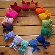
The pattern can be found on Ravelry right here : http://www.ravelry.com/patterns/library/catnip-bunny
To make these use the IxCHeL Mini skeins for example ! Easy and a fun little project!
Please don't hesitate to contact me at any time if you have any questions okay? Always happy to enable. All my contact details are to be found at the end of this weeks blog entry. Have fun !!!
IxCHeL Mini skeins
The cutest little multi coloured skeins !!
10 mini skeins for $12

IxCHeL Gift Packs
IxCHeL GIFT VOUCHERS or SURPRISE PACKS !
Want to give somebody something special and still let them pick out their fav colour or fibre blend? Well, search no more: I offer an IxCHeL gift voucher package that is so hard to resist you even want to buy one for yourself ..lol Here’s the deal:
FIBRE OR YARN OR BOTH! SURPRISE PACK
just let me know the value you would like to spend and the favourite colours of the recipient(or yourself..lol) and I will put together a surprise pack for you and add at least $60 extra worth of goods to the parcel(for all surprise pack orders over $150) just to say thank you and have happy holidays ! :-)
AU$25 Personalised giftvoucher Pack
Comes with a personalised gift voucher and free post for the receivers first order in Australia !
AU$50 Personalised giftvoucher Pack
Comes with a personalised giftvoucher, free post for the receivers first order in Australia ! and a cute badge a bunny photo and last but not least some amazing fluffy stuff in a gift pack
AU$100 Personalised giftvoucher Pack
Comes with a personalised Christmas giftvoucher, free post for the receivers first order in Australia !, a badge, and last but not least some amazing fluffy stuff and yarn in a gift pack! Just let me know what giftvoucher pack you would like to gift to a friend or hey, you can even gift it to yourself ! And I will send you all the details.
How To Order:
1. You can email me on ixchel at rabbit dot com dot au or ixchelbunny at yahoo dot com dot au
2. message me on facebook or ravelry where I am Ixchelbunny.
I will email you right back with all your order details and payment methods.
Any questions? Any custom orders for yarn or dyeing fibre? Please don’t hesitate to ask! Always happy to enable.
2. message me on facebook or ravelry where I am Ixchelbunny.
I will email you right back with all your order details and payment methods.
Any questions? Any custom orders for yarn or dyeing fibre? Please don’t hesitate to ask! Always happy to enable.
Thank you so much for your help and support !
RABBIT ON !
((hugs))
Charly


No comments:
Post a Comment